
Medgaz: Building a New Brand
Hi! I’m Marta Longan, visual designer at Digital Wolves. In this text, I explain the steps we followed during 8 weeks to build the new corporate image for Medgaz.
Medgaz Rebranding
Rebranding is a marketing strategy that involves a partial or total modifcation of a the set of elements that identify a brand in order to improve its positioning.
There are many reasons to rebrand a Brand: to expand the business to other markets, to attract a new target audience or simply to refresh the brand image. Whatever the reason, it is important to know how to manage this change for it to be successful.
“Progress consists of renewal” Miguel de Unamuno.
How we worked
Medgaz is the company in charge of the design, construction and operation of the Algeria-Europe underwater gas pipeline.
On the occasion of its 10th anniversary, Medgaz needed a new corporate image that would reflect its 10 years of uninterrupted service, the continuity of supply and that would maintain the three graphic concepts of its current logo, the sea, a gas pipeline and land.
Based on the three points to be highlighted and maintained, we began the project.
Empathising, Understanding, Devising and Shaping
Empathising
We conducted various interviews with the steakholders involved in the project to find out their opinions and needs for the brand. We drew up a SWOT to find out the weaknesses, threats, strengths and opportunities that the company has in the sector.
Understanding
We created an inspirational moodboard at a chromatic and art direction level based on the analysis of the brand’s material, images of sea, land, industrial elements… From this set of images we drew the main corporate colours for the new logo design.
Devising
We developed a benchmark of design trends to detect the standards and graphic resources used by different companies in the same sector in their logos. The result was:
- Use of lower case letters in the logo.
- Use of solid and consistent colours.
- Use of isotype as a symbol of the brand.
- Predominant colour, blue.
- Use of geometric shapes.
Shaping
And we reached this stage… it was time to translate all the previous analysis into sketches.
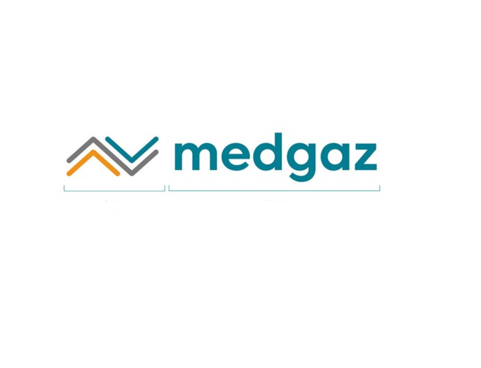
We designed the first sketches inspired by geometric shapes and patterns that represented the three graphic concepts (the sea, a gas pipeline and the earth), and we validated them with the client until we achieved the isotype that represented the brand values.
We then chose the typography for the logo, opting for a modern and elegant sans-serif typeface and its typeface family designed with geometric shapes and without decorative distractions. We changed the use of uppercase to lowercase letters in the logo to transmit agility and dynamism.
The only thing missing was the colour. We avoided gradients and opted for solid and consistent colours. Choosing different shades of the current colours.
Before and After Medgaz
Designing the Medgaz logo was a challenge that seemed simple at first. The client wanted to keep the three elements of their current logo and the main colours.
We worked on new geometric shapes, new colours and chose new typographies.
Now the new image of Medgaz looks to the future, it is positioned as a new, more updated and dynamic brand, keeping the defined principles: continuity, stability, evolution and security.